
 TL;DR
TL;DR
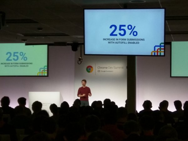
Make your forms as short as possible. The best form is no form. If you must have ‘few’ fields, make sure you optimized for Autofill with the right autocomplete attributes. As you can see in the image above, it’s moving the needle, for real.
Now, if you have another 4 minutes, here are few points to think while you are designing you next form.
‘No Form’ is the best
Think how to strip down all the unnecessary fields (e.g. one click to pay) and get only the ‘must have’ ones. The best form is no form.

Make your form as short and simple as possible
In case you don’t need a certain piece of data at that point. Don’t ask for it. Prioritize, simplify and consolidate questions.
If you can save ‘clicks’ or steps for your users – please do so!

Make your forms quick to finish
The image above tells the story. You want users to think “this will be a breeze – It’s easy”. You should use autocomplete and pre-populate fields with existing data when you have it for sign-in users. If you wish to master autocomplete, try this Autocomplete code lab that I wrote.
Add visual indicators to illuminate their progress.
In many cases, you will have few sections for your form. Make sure you are showing a clear path to your users. In each phase, it should be clear to them what is done and what is left to do. A good example is amazon shopping experience. See in the image below.

Another example is from Progressive mobile web app.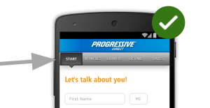
Please remember that forms are the barrier between your goals (sales, registrations, conversation etc’) and your users goals. You should keep test, research, iterate and improve them over time. It’s important to measure every aspect and optimize it.
Misc
Discover more from Ido Green
Subscribe to get the latest posts sent to your email.
